
Misunderstandings! In the Emergency Room.*#
( * A bad Panic! At the Disco Reference. )
Setup#
As always, let’s import the packages we need and set a random seed in NumPy, which will generate the same figure you see in the textbook. If you want to run this with truly random data, just comment out the np.random.seed() line.
import numpy as np
import pandas as pd
import matplotlib.pyplot as plt
from scipy import stats

# Set random seed for reproducibility
np.random.seed(42)
Simulate our dataset#
n_patients = 1000

# Generate ages from a gamma distribution, scaled and truncated to 18-99
ages = (np.random.gamma(3, 8, n_patients) + 18).astype(int)
ages = np.clip(ages, 18, 98)

baseline_adverse_rate = 0.20
adverse_events = np.random.random(n_patients) < baseline_adverse_rate

df = pd.DataFrame({
    'age': ages,
    'adverse_event': adverse_events.astype(int)
})

# Now inject the problematic data: unknown ages coded as 99
n_unknown = 50  # 5% of patients have unknown age
unknown_indices = np.random.choice(df.index, n_unknown, replace=False)

# The '99' patients have much higher adverse event rate (80%)
df.loc[unknown_indices, 'age'] = 99
df.loc[unknown_indices, 'adverse_event'] = (np.random.random(n_unknown) < 0.80).astype(int)

# Look at the first 10 patients
df.head(10)
| age | adverse_event | |
|---|---|---|
| 0 | 46 | 0 |
| 1 | 37 | 0 |
| 2 | 36 | 0 |
| 3 | 36 | 0 |
| 4 | 67 | 0 |
| 5 | 51 | 0 |
| 6 | 99 | 1 |
| 7 | 47 | 0 |
| 8 | 42 | 1 |
| 9 | 22 | 0 |
First, we’ll look to see if we find different rates of adverse events if we bin by age:
print(df.groupby(pd.cut(df['age'], bins=[18, 40, 60, 80, 99]), observed=True)['adverse_event'].mean())

# Adverse event rate by age
age_bins = pd.cut(df['age'], bins=20)
adverse_by_age = df.groupby(age_bins, observed=True)['adverse_event'].mean()

# Get the midpoint of each age bin for plotting
bin_midpoints = [interval.mid for interval in adverse_by_age.index]

plt.plot(bin_midpoints, adverse_by_age.values, 'o-')
plt.xlabel('Age')
plt.ylabel('Adverse Event Rate')
plt.show()
age
(18, 40]    0.198830
(40, 60]    0.201807
(60, 80]    0.157303
(80, 99]    0.723077
Name: adverse_event, dtype: float64
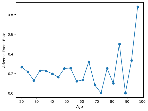
Wow, looks like people in the 80-99 bucket have a much higher incidence of adverse events! However, the problem becomes obvious when we look at the age distribution:
plt.hist(df['age'], bins=50, edgecolor='black')
plt.xlabel('Age')
plt.ylabel('Count')

plt.tight_layout()
plt.show()
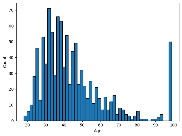
In this case, we should exclude all of the patients whose ages are exactly 99. Unfortunately, this means we will also lose people who were legitimately 99 years old – underscoring the importance of smartly choosing ways to encode missing values (e.g., with NaN)!
df_clean = df[df['age'] != 99] # filter out anyone whose age is equal to 99

print(df.groupby(pd.cut(df_clean['age'], bins=[18, 40, 60, 80, 99]), observed=True)['adverse_event'].mean())
age
(18, 40]    0.198830
(40, 60]    0.201807
(60, 80]    0.157303
(80, 99]    0.200000
Name: adverse_event, dtype: float64
As you can see, now the rate of adverse events is much more even across ages once we exclude those individuals that were erroneously coded with 99.