Defining cell types by their electrophysiology#
The brain has thousands of different types of cells. How do we even begin to tease them apart?#
We can define neurons by their gene expression patterns, electrophysiology features, and structure. Here, we’ll use those three features to compare and contrast cell types in the brain.
This notebook will help us investigate specific features in the electrophysiology dataset from the Allen Brain Atlas. Along the way, you’ll encounter some concepts about coding in Python.
Step 1. Set up our coding environment#
Whenever we start an analysis in Python, we need to be sure to import the necessary code packages. If you’re running this notebook on Colab or Binder, the cells below will install packages into your coding environment – we are not installing anything on your computer.
Install the AllenSDK#
The Allen Institute has compiled a set of code and tools called a Software Development Kit (SDK). These tools will help us import and analyze the cell types data.
Task: Run the cell below, which will install the allensdk into your coding environment.
Technical notes about installing the allensdk
If you’re running this in Colab, you’ll also be prompted to Restart Runtime after this is completed. Click the Restart Runtime button (nothing will happen), and then you’re ready to proceed.
If you receive an error or are running this notebook on your local computer, there are additional instructions on how to install the SDK locally here.
# This will ensure that the AllenSDK is installed.
try:
    import allensdk
    print('allensdk imported')
except ImportError as e:
    !pip install allensdk
allensdk imported
Task: We also need to make sure that our coding environment has NumPy, Pandas, and Matplotlib already installed. Run the cell below – any packages that are missing will be installed for you.
# This will ensure that NumPy, Pandas, and Matplotlib are installed.
try:
    import numpy
    print('numpy already installed')
except ImportError as e:
    !pip install numpy
try:
    import pandas
    print('pandas already installed')
except ImportError as e:
    !pip install pandas
try:
    import matplotlib
    print('matplotlib already installed')
except ImportError as e:
    !pip install matplotlib
numpy already installed
pandas already installed
matplotlib already installed
Import common packages#
Below, we’ll import a common selection of packages that will help us analyze and plot our data.
# Import our plotting package from matplotlib
import matplotlib.pyplot as plt
import pandas as pd
import numpy as np

%whos
Variable     Type      Data/Info
--------------------------------
allensdk     module    <module 'allensdk' from '<...>es/allensdk/__init__.py'>
matplotlib   module    <module 'matplotlib' from<...>/matplotlib/__init__.py'>
np           module    Shape: <function shape at 0x108b01a80>
numpy        module    Shape: <function shape at 0x108b01a80>
pandas       module    <module 'pandas' from '/o<...>ages/pandas/__init__.py'>
pd           module    <module 'pandas' from '/o<...>ages/pandas/__init__.py'>
plt          module    <module 'matplotlib.pyplo<...>es/matplotlib/pyplot.py'>
Import the CellTypesModule from the allensdk#
With the allensdk installed, we can import the CellTypesCache module.
The CellTypesCache that we’re importing provides tools to allow us to get information from the cell types database. We’re giving it a manifest filename as well. CellTypesCache will create this manifest file, which contains metadata about the cache. If you want, you can look in the cell_types folder in your code directory and take a look at the file.
Task: Run the cell below. If you’d like a slightly faster way of working with the raw data files required by this notebook, you can also uncomment (remove the
#) from the!gitand%cdlines below to clone the data from Github.
#Import the "Cell Types Cache" from the AllenSDK core package
from allensdk.core.cell_types_cache import CellTypesCache

#If you're short on time, clone the repository to get the raw data
#!git clone https://github.com/ajuavinett/CellTypesLesson.git
#%cd CellTypesLesson

#Initialize the cache as 'ctc' (cell types cache)
ctc = CellTypesCache(manifest_file='cell_types/manifest.json')

print('CellTypesCache imported.')
CellTypesCache imported.
Step 2. Import Cell Types data#
Now that we have the module that we need, let’s import a raw sweep of the data. The cell below will grab the data for the same experiment you just looked at on the website. This data is in the form of a Neuroscience Without Borders (NWB) file.
You can see this same cell on the Allen Institute website.
This might take a minute or two. You should wait until the circle in the upper right is not filled (Jupyter Notebook) or you have a green checkmark (Colab) to continue.
# Get the data for one cell (
cell_id = 474626527

# Get the electrophysiology (ephys) data for that cell
data = ctc.get_ephys_data(cell_id)
print('Data retrieved')
Data retrieved
Thankfully, our NWB file has some built-in methods to enable us to pull out a recording sweep. We can access methods of objects like our data object by adding a period, and then the method. That’s what we’re doing below, with data.get_sweep().
# We've chosen a sweep with some action potentials
sweep_number = 28

sweep_data = data.get_sweep(sweep_number)
print('Sweep obtained')
Sweep obtained
Step 3. Plot a raw sweep of data#
Now that you’ve pulled down some data, chosen a cell, and chosen a sweep number, let’s plot that data.
Task: Run the cell below to get the stimulus and recorded response information from the dataset.
# Get the stimulus trace (in amps) and convert to pA
stim_current = sweep_data['stimulus'] * 1e12

# Get the voltage trace (in volts) and convert to mV
response_voltage = sweep_data['response'] * 1e3

# Get the sampling rate and can create a time axis for our data
sampling_rate = sweep_data['sampling_rate'] # in Hz
timestamps = (np.arange(0, len(response_voltage)) * (1.0 / sampling_rate))
Task: In the cell below, use the
plt.plot(x,y)to plot our voltage trace.
You will need to give it two arguments, which are variables we created above:
timestamps(x axis) andresponse_voltage(y).
Without changing the limits on the x-axis, you won’t be able to see individual action potentials.
Modify the x-axis using
plt.xlim([min,max])to specify the limits (replaceminandmaxwith numbers that make sense for this x-axis.If you’d like to plot the current that was injected into the cell, you can plot
stim_currentinstead ofresponse_voltage.
# Plot the raw recording here
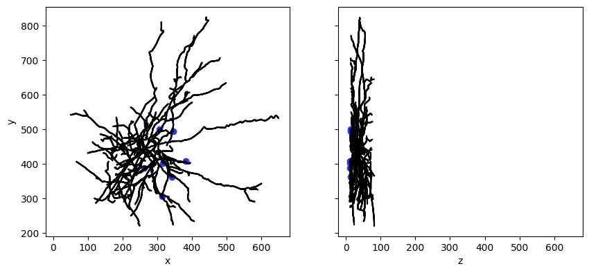
Step 4. Plot the morphology of the cell#
The Cell Types Database also contains 3D reconstructions of neuronal morphologies. Here, we’ll plot the reconstruction of our cell’s morphology.
Note: It will take several minutes to run the cell below, possibly longer over a slow internet connection. Running this cell is optional and can be skipped if necessary.
# Import necessary toolbox
from allensdk.core.swc import Marker

# Download and open morphology and marker files
morphology = ctc.get_reconstruction(cell_id)
markers = ctc.get_reconstruction_markers(cell_id)

# Set up our plot
fig, axes = plt.subplots(1, 2, sharey=True, sharex=True, figsize=(10,10))
axes[0].set_aspect('equal')
axes[1].set_aspect('equal')

# Make a line drawing of x-y and y-z views
for n in morphology.compartment_list:
    for c in morphology.children_of(n):
        axes[0].plot([n['x'], c['x']], [n['y'], c['y']], color='black')
        axes[1].plot([n['z'], c['z']], [n['y'], c['y']], color='black')

# cut dendrite markers
dm = [ m for m in markers if m['name'] == Marker.CUT_DENDRITE ]
axes[0].scatter([m['x'] for m in dm], [m['y'] for m in dm], color='#3333ff')
axes[1].scatter([m['z'] for m in dm], [m['y'] for m in dm], color='#3333ff')

# no reconstruction markers
nm = [ m for m in markers if m['name'] == Marker.NO_RECONSTRUCTION ]
axes[0].scatter([m['x'] for m in nm], [m['y'] for m in nm], color='#333333')
axes[1].scatter([m['z'] for m in nm], [m['y'] for m in nm], color='#333333')
axes[0].set_ylabel('y')
axes[0].set_xlabel('x')
axes[1].set_xlabel('z')
plt.show()
Step 5. Analyze pre-computed features#
The Cell Types Database contains a set of features that have already been computed, which could serve as good starting points for analysis. We can query the database to get these features. Below, we’ll use the Pandas package that we imported above to create a dataframe of our data.
Task: Run the cell below. It’ll take ~10 seconds. It will print a list of all of the feature available, as well as produce a dataframe, which looks something like an Excel spreadsheet. You can scroll to the right to see many of the different features available in this dataset.
# Download all electrophysiology features for all cells
ephys_features = ctc.get_ephys_features()
dataframe = pd.DataFrame(ephys_features).set_index('specimen_id')

print('Ephys features available for %d cells:' % len(dataframe))
dataframe.head() # Just show the first 5 rows (the head) of our dataframe
Ephys features available for 2333 cells:
| adaptation | avg_isi | electrode_0_pa | f_i_curve_slope | fast_trough_t_long_square | fast_trough_t_ramp | fast_trough_t_short_square | fast_trough_v_long_square | fast_trough_v_ramp | fast_trough_v_short_square | ... | trough_t_ramp | trough_t_short_square | trough_v_long_square | trough_v_ramp | trough_v_short_square | upstroke_downstroke_ratio_long_square | upstroke_downstroke_ratio_ramp | upstroke_downstroke_ratio_short_square | vm_for_sag | vrest | |
|---|---|---|---|---|---|---|---|---|---|---|---|---|---|---|---|---|---|---|---|---|---|
| specimen_id | |||||||||||||||||||||
| 529878215 | NaN | 134.700000 | 22.697498 | 8.335459e-02 | 1.187680 | 13.295200 | 1.025916 | -56.375004 | -57.385420 | -57.431251 | ... | 13.295680 | 1.134780 | -56.593754 | -57.739586 | -74.143753 | 3.029695 | 3.061646 | 2.969821 | -80.468750 | -73.553391 |
| 548459652 | NaN | NaN | -24.887498 | -3.913630e-19 | 1.099840 | 20.650105 | 1.025460 | -54.000000 | -54.828129 | -54.656254 | ... | 20.650735 | 1.160940 | -55.406254 | -55.242191 | -73.500000 | 2.441895 | 2.245653 | 2.231575 | -84.406258 | -73.056595 |
| 579978640 | 0.009770 | 39.044800 | -46.765002 | 5.267857e-01 | 1.157840 | 2.551310 | 1.025387 | -59.500000 | -58.234378 | -59.940975 | ... | 2.551960 | 1.089851 | -60.062500 | -58.570314 | -61.371531 | 2.023762 | 2.162878 | 2.006406 | -93.375008 | -60.277321 |
| 439024551 | -0.007898 | 117.816429 | 5.996250 | 1.542553e-01 | 1.989165 | 9.572025 | 1.028733 | -47.531250 | -50.359375 | -65.500000 | ... | 9.576308 | 1.423229 | -49.406254 | -52.718752 | -75.273443 | 3.105931 | 3.491663 | 1.733896 | -87.656250 | -75.205559 |
| 515188639 | 0.022842 | 68.321429 | 14.910000 | 1.714041e-01 | 1.081980 | 2.462880 | 1.025620 | -48.437504 | -46.520837 | -51.406253 | ... | 2.490433 | 1.479690 | -53.000004 | -54.645837 | -64.250003 | 3.285760 | 3.363504 | 4.234701 | -81.625008 | -63.474991 |
5 rows × 55 columns
As you can see in the dataframe above, there are many pre-computed features available in this dataset. Here’s a glossary, in case you’re curious.

Image from the Allen Institute Cell Types Database Technical Whitepaper.
Let’s first look at the speed of the trough, and the ratio between the upstroke and downstroke of the action potential:
Action potential fast trough (
fast_trough_v_long_square): Minimum value of the membrane potential in the interval lasting 5 ms after the peak.Upstroke/downstroke ratio (
upstroke_downstroke_ratio_long_square): The ratio between the absolute values of the action potential peak upstroke and the action potential peak downstroke.
Above, we created a pandas dataframe of all of these features. Here, we’ll assign the columns we’re interested to two different variables, so that they will contain all of the datapoints we’re interested in. We can access different columns of the dataframe by using the syntax dataframe['column_of_interest']. The columns of interest here are fast_trough_v_long_square and upstroke_downstroke_ratio_long_square].
Task: Edit and run the cell below to store these columns into our two new variables.
fast_trough = ...
upstroke_downstroke = ...
Task: Create a scatterplot that plots the fast trough (x axis) versus the upstroke-downstroke ratio (y axis). Label your axes accordingly using
plt.xlabel()andplt.ylabel().
If you need help, see the plt.scatter() documentation.
# Your scatterplot here
It looks like there may be roughly two clusters in the data above. Maybe they relate to whether the cells are presumably excitatory (spiny) cells or inhibitory (aspiny) cells. Let’s query the API and split up the two sets to see.
Task: The cell below will dig up the dendrite type of these cells and add that to our dataframe. Then, it’ll create our same scatterplot, where each dot is colored by dendrite type. All you need to do is run the cell!
# Get information about our cells' dendrites
cells = ctc.get_cells()
full_dataframe = dataframe.join(pd.DataFrame(cells).set_index('id'))

# Create a dataframe for spiny cells, and a dataframe for aspiny cells
spiny_df = full_dataframe[full_dataframe['dendrite_type'] == 'spiny']
aspiny_df = full_dataframe[full_dataframe['dendrite_type'] == 'aspiny']

# Create our plot! Calling scatter twice like this will draw both of these on the same plot.
plt.scatter(spiny_df['fast_trough_v_long_square'],spiny_df['upstroke_downstroke_ratio_long_square'])
plt.scatter(aspiny_df['fast_trough_v_long_square'],aspiny_df['upstroke_downstroke_ratio_long_square'])

plt.ylabel('upstroke-downstroke ratio')
plt.xlabel('fast trough depth (mV)')
plt.legend(['Spiny','Aspiny'])

plt.show()
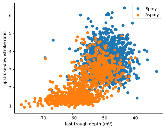
Looks like these two clusters do partially relate to the dendritic type. Cells with spiny dendrites (which are typically excitatory cells) have a big ratio of upstroke:downstroke, and a more shallow trough (less negative). Cells with aspiny dendrites (typically inhibitory cells) are a little bit more varied. But only aspiny cells have a low upstroke:downstroke ratio and a deeper trough (more negative).
Step 6. Compare waveforms#
Let’s take a closer look at the action potentials of these cells to see what these features actually mean for the action potential waveform by choosing one of the cells with the highest upstroke:downstroke ratio. Our first line of code, where it says dataframe.sort_values() is the code that will arrange our dataframe by the upstroke_downstroke_ratio_long_square column.
This first time around, we’ll organize it so that the highest ratio is at the top (ascending=False). This is an example of a boolean in Python. You can change this to say ascending=True if you want to sort with lowest ratio at the top.
Task: Run the cell below.
# Sort the dataframe and reassign
sorted_dataframe = dataframe.sort_values('upstroke_downstroke_ratio_long_square',ascending=False)

# Assign one of the top cells in our dataframe (default = 2) and the ratio to different variables
specimen_id = sorted_dataframe.index[2]
ratio = sorted_dataframe.iloc[2]['upstroke_downstroke_ratio_long_square']

# Print our results so that we can see them
print('Specimen ID: ' + str(specimen_id) + ' with upstroke-downstroke ratio: ' + str(ratio))
Specimen ID: 510106222 with upstroke-downstroke ratio: 6.09655607293524
Now we can take a closer look at the action potential for that cell by grabbing a raw sweep of recording from it, just like we did above.
Task: Run the cell below. This may take a minute or so. Note: You may receive a “H5pyDeprecationWarning,” but you can ignore this!
# Get the data for our specimen
upstroke_data = ctc.get_ephys_data(specimen_id)

# Get one sweep for our specimen (I've already handselected a gorgeous one for you, 45)
upstroke_sweep = upstroke_data.get_sweep(45)

# Get the current & voltage traces
current = upstroke_sweep['stimulus'] * 1e12 # in A, converted to pA
voltage = upstroke_sweep['response'] * 1e3 # converted to mV!

# Get the time stamps for our voltage trace
timestamps = (np.arange(0, len(voltage)) * (1.0 / upstroke_sweep['sampling_rate']))

print('Sweep obtained')
Sweep obtained
Task: Plot the sweep we obtained above. Hint: You’ll want to use
plt.plot(x,y)wherexis thetimestampsandyis thevoltage. Be sure to give your plot accurate labels as well.
# Plot the new sweep here
Task Generate a similar plot for a cell with a low upstroke ratio. Similiar to above, zoom in on the x axis so that you can actually see the shape of the action potential waveform.
Hint: You only need to change one value in all of the code in this step in order to make this change. How did we arrange our dataframe at first?
As you’ll hopefully see, even that one feature, upstroke:downstroke ratio, means the shape of the action potential is dramatically different. The other feature we looked at above, size of the trough, is highly correlated with upstroke:downstroke. You can see that by comparing the two cells here. Cells with high upstroke:downstroke tend to have less negative troughs (undershoots) after the action potential.
Step 7. Compare cell types#
Let’s get out of the action potential weeds a bit. What if we want to know a big picture thing, such as are human cells different than mouse cells? Or how are excitatory cells different from inhibitory cells? To ask these questions, we can pull out the data for two different cell types, defined by their species, dendrite type, or transgenic line.
About Transgenic Cre Lines. The Allen Institute for Brain Science uses transgenic mouse lines that have Cre-expressing cells to mark specific types of cells in the brain. This technology is called the Cre-Lox system, and is a common way in neuroscience (and some other fields) to target cells based on their expression of specific genetic promotors. For more information about Cre/Lox technology, see this website. Information about the different Cre lines that are available can be found in this glossary or on the Allen Institute’s website.
For this final step, it’s up to you to choose which cell types to compare. You’ll also decide which pre-computed feature to compare between these cell types.
If you’d like to compare cells from different species, the column name is
species.If you’d like to compare spiny vs. aspiny cells, the column name is
dendrite_type.If you’d like to compare two transgenic lines (mouse cells only), the column name is
transgenic_line. What if we want to know whether different genetically-identified cells have different intrinsic physiology?If you’d like to compare two disease states (human cells only; samples taken from people either with epilepsy and brain tumors), the column name is
disease_state.
Task: Assign
column_namebelow to the name of your column to see the unique values in that column. Make sure your column is a string, in other words, it should be in single quotes.
# Define your column name below
column_name = ...

print(full_dataframe[column_name].unique())
---------------------------------------------------------------------------
KeyError                                  Traceback (most recent call last)
File /opt/miniconda3/envs/jb_py311/lib/python3.11/site-packages/pandas/core/indexes/base.py:3802, in Index.get_loc(self, key, method, tolerance)
   3801 try:
-> 3802     return self._engine.get_loc(casted_key)
   3803 except KeyError as err:

File /opt/miniconda3/envs/jb_py311/lib/python3.11/site-packages/pandas/_libs/index.pyx:138, in pandas._libs.index.IndexEngine.get_loc()

File /opt/miniconda3/envs/jb_py311/lib/python3.11/site-packages/pandas/_libs/index.pyx:165, in pandas._libs.index.IndexEngine.get_loc()

File pandas/_libs/hashtable_class_helper.pxi:5745, in pandas._libs.hashtable.PyObjectHashTable.get_item()

File pandas/_libs/hashtable_class_helper.pxi:5753, in pandas._libs.hashtable.PyObjectHashTable.get_item()

KeyError: Ellipsis

The above exception was the direct cause of the following exception:

KeyError                                  Traceback (most recent call last)
Cell In[17], line 4
      1 # Define your column name below
      2 column_name = ...
----> 4 print(full_dataframe[column_name].unique())

File /opt/miniconda3/envs/jb_py311/lib/python3.11/site-packages/pandas/core/frame.py:3807, in DataFrame.__getitem__(self, key)
   3805 if self.columns.nlevels > 1:
   3806     return self._getitem_multilevel(key)
-> 3807 indexer = self.columns.get_loc(key)
   3808 if is_integer(indexer):
   3809     indexer = [indexer]

File /opt/miniconda3/envs/jb_py311/lib/python3.11/site-packages/pandas/core/indexes/base.py:3804, in Index.get_loc(self, key, method, tolerance)
   3802     return self._engine.get_loc(casted_key)
   3803 except KeyError as err:
-> 3804     raise KeyError(key) from err
   3805 except TypeError:
   3806     # If we have a listlike key, _check_indexing_error will raise
   3807     #  InvalidIndexError. Otherwise we fall through and re-raise
   3808     #  the TypeError.
   3809     self._check_indexing_error(key)

KeyError: Ellipsis
Using the possible values in your column, create two separate dataframes by subsetting the dataframe below. Assign
celltype_1andcelltype_2to the names of your cell types, for example ‘spiny’ and ‘aspiny’. Make sure your cell type names are in quotes (they should be strings) and exactly match what is found in the dataframe.
# Define your cell type variables below
celltype_1 = ...
celltype_2 = ...

celltype_1_df = full_dataframe[full_dataframe[column_name] == celltype_1]
celltype_2_df = full_dataframe[full_dataframe[column_name] == celltype_2]

print("Type 1 # Cells: %d" % len(celltype_1_df))
print("Type 2 # Cells: %d" % len(celltype_2_df))
Let’s start by plotting a distribution of the recorded resting membrane potential (vrest) for one cell type versuss the other cell type.
Task: Run the cell below to plot a histogram to compare one pre-computedd feature of your choice between your two cell types.
Note that the distribution is normalized by the total count (
density=True), since there may be very different numbers of cells for your two cell types. You can setdensityto false to plot the raw numbers of cells.You can also specify the number of bins with
bins= < #bins >.Look through the
plt.hist()documentation for more information.
plt.figure()

# Change your feature below.
feature = 'vrest'

# Plot the histogram, with density = True
plt.hist([celltype_1_df[feature],celltype_2_df[feature]],density = True)

# Change the x label below:
plt.xlabel('< feature name >')
plt.ylabel('Normalized Number of Cells')
plt.legend(['Cell Type 1','Cell Type 2'])
plt.show()
Task: Choose a different feature to compare between your cell types, and rerun the plot above. Use the documentation below to get the exact name of the feature (in parentheses), and change the x label axis so that we know what you’re plotting. Right click to save your image when you’re done.
Here are a few additional pre-computed features you might consider comparing (you can find a complete glossary here):
Tau (
tau): time constant of the membrane in millisecondsAdapation ratio (
adaptation): The rate at which firing speeds up or slows down during a stimulusAverage ISI (
avg_isi): The mean value of all interspike intervals in a sweepSlope of f/I curve (
f_i_curve_slope): slope of the curve between firing rate (f) and current injectedInput Resistance (
input_resistance_mohm): The input resistance of the cell, in megaohms.Voltage of after-hyperpolarization (
trough_v_short_square): minimum value of the membrane potential during the after-hyperpolarization
Task: It’s more common to plot summary statistics like a mean or median, so let’s compare our two cell types with a boxplot. To do so, we can use
plt.boxplot()(Documentation here). The code below is already set up for you – just run it and edit your labels as necessary. Right click to save the plot when you’re done.
# Boxplot creation lines below
plt.boxplot([celltype_1_df[feature],celltype_2_df[feature]])
plt.ylabel('< your label here > ') # y-axis label
plt.xticks([1, 2], ['Cell Type 1','Cell Type 2'])

# Plot title -- be sure to update!
plt.title('< your title here > ')

plt.show()
That’s it for today – great work!
from IPython.display import HTML
print('Nice work!')
HTML('<img src="https://media.giphy.com/media/xUOwGhOrYP0jP6iAy4/giphy.gif">')
Technical notes & credits#
This notebook demonstrates most of the features of the AllenSDK that help manipulate data in the Cell Types Database. The main entry point will be through the CellTypesCache class. CellTypesCache is responsible for downloading Cell Types Database data to a standard directory structure on your hard drive. If you use this class, you will not have to keep track of where your data lives, other than a root directory.
Much more information can be found in the Allen Brain Atlas whitepaper as well as in their GitHub documentation.
This file modified from this notebook.
In case you’re curious, here’s documentation for plotting pandas series (which we do quite a bit above). You can always Google questions you have!)